Have you ever shown a set of three foreign, delicious looking chocolates to a kid and said "pick one and its all yours" ?? Ever seen the way the child reacts? unsure on what to pick... Well thats exactly what goes in through your user's mind when he lands up in your apps home page the first ever time. 'Oh there are these attractive looking buttons and each does something. But where do i start, which button do i click and what should i do first?!'
The simple hard truth is this: Options are a bitch. Especially so when you have no clear idea on what each of the option would do. As a web programmer putting in three buttons on homepage and letting the user decide on what he wants to do amounts not to, giving choices to the user, but escapism in the part of the programmer.
Understanding and immersing yourself into an app is more or less like trying to do your shirt buttons with your left hand, Its not a hard task, but is definitely, tedious and time consuming and requires a lot of practice.
There is also another case. As a developer you would think it would be cool to get rid of the save button altogether, i mean all the user needs to do is edit text and close and Tada!! your text is saved. Isn't that cool?? you saved the user from having to perform a monotonous click on the save button. But guess what is actually going through your users mind : "Where is the save button? how does the save button work. Does it auto save? Oh wait this app dose not have a save button at all!! editing the text alone should do the trick. Darn."
So that ladies and gentlemen app developers, are the two ends of the problem. You either give the user a plethora of option from which he has to pick from or you do not give them an option at all when he is looking for one.
In either case you are making the user think. Every cluster of interaction in your app puts your users thought process through a decision tree, they have to think about the interface rather than the problem they are trying to solve in the first place with the app. No wonder they all complain about the app being "tedious" even though you "hacked" on usability.
A usability expert will come in and streamline your entire app and try to remove as many interface decision points as possible. But then it will just not be possible to completely remove those trick points, will it? I firmly believe that the user will eventually be put through an interface decision point, in every app possible as long as its not an online TODO list. UX fixes will plateau the peak of the app user experience, however it will never be able to bridge the gap between what is the expected usage flow according to the developers and what is going on in the users mind.
What to me is an ideal way to enhance the user experience in your app is to gently nudge your users at the various decision points to push them along the flow you want them to follow as an app developer. You should be "parenting" your users saying, "hey start off by clicking this button, we can come to the other stuff later"!!
Lets look at it this way, look at the following example, from a developers perspective its dead simple and strainght, no complication what so ever, user can either post something in a forum or can read already posted options. Simple straight and clean.
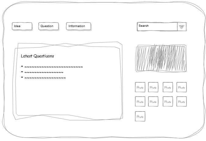
As a first time user however this is what will be going through your mind. "Oh there is a lot of posts, wait what is an idea and what are informations and what should i do to get started? should i be reading up previous questions before i post or should i be posting my question and just move along, for thats why i ended up in the forum in the first place..."
Lets do an enhancement to this design, i am now going to do a dangerous thing, i am going to assume as an app developer that most of my first time users have signed up not to browse the forum, but to post something. So everything else in the page apart from the three simple buttons on the top is noise to them and their thought process. so we will go ahead and put a floaty arrow on the page for the first time users alone to point towards the three buttons on the top to post a question, idea or information.
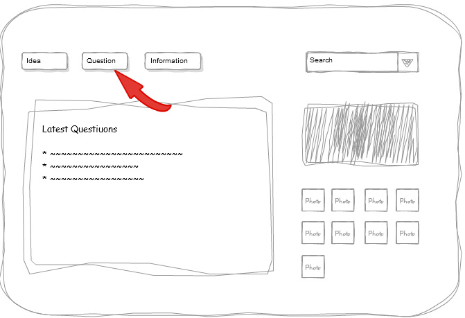
You have managed to seek your users attention to an extent with the arrow and you have pointed him down to the place where he can get started, this is a good start. However this is what will be going through your users mind when he looks at the above interface cluster: "Hey i have something in my mind and i am sure its definitely not a question. but should i post it under information, because its informative or should i post it under idea, and hey is it even possible to change an idea later to information"
Designers try to simplify the user experience by providing your entire app in crystal clear shades of black and white, however, the real world especially for the first time user is neither black nor white, its a myriad shades of grey. Users constantly try to read through the interface to decipher the 'flow' of operation and if this flow is not made explicit in the first go, users get confused and frustrated. To the Above example we will add one more enhancement that looks as follows:
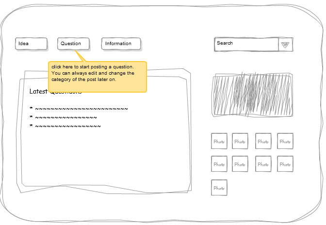
Now if you see, you will realize that we put a small float box on our app that says that, you can start trying the app by clicking on either of the three and that, it is indeed possible later on to change the category of the post. Cool, the user now knows that he can go ahead and post and that there is also contingency against any screw ups in post categorization. You successfully helped your first time users cross over the information decision point related to this particular cluster of user interface elements.
The art of engaging first time users is to be present with them across these interface decision points and get them used to the "flow" of the app. Its like walking through the jungle, and you as the app developer must leave a trail of bread crumbs for your users to follow.
This is the thought process that went into our minds when we started writing
Tour My App six months back. We want to be able to help our fellow app developers with enough 'bread' to leave a trail of breadcrumbs. At
TourMyApp you can create tour guides to walk your users through the app's flow, so that they get engaged and productive quickly. You can save them from having to explore the vast expanses of your app and engage them in a process of guided and layered discovery. In short you can make them enjoy your app without many of the WTF moments associated with the usage of a new web app.